The brand · from gb to g·b
Drawn in code. Decided with people.
This is the story of the symbol at the top of this page: where it came from, the problem that showed up along the way and the test that settled the final form.
Where it came from
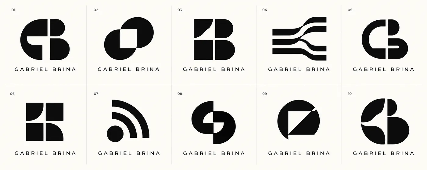
I started with boards generated by AI, based on a book I really like: Jens Müller's Logo Modernism, a collection of modernist marks. They were a starting point, not an answer.
From then on, nothing was drawn by hand. Each symbol is a Python script that writes SVG. Changing a measurement means changing a number and running it again.
There were ten rounds. In some of them, each concept came from the principle behind a reference: Karl Gerstner's programmes, the lines spreading out of Lance Wyman's Mexico 68, Paul Rand's humour, Anton Stankowski's diagonal, the vibrating grid of Hélio Oiticica's Metaesquemas. I took the rule, not the shape.
The form
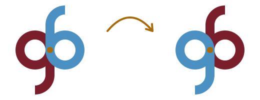
In the second round the design that stayed appeared: a lowercase g and b sharing the same stem. Turn it 180° and the g becomes a b. One shape, read from both sides.
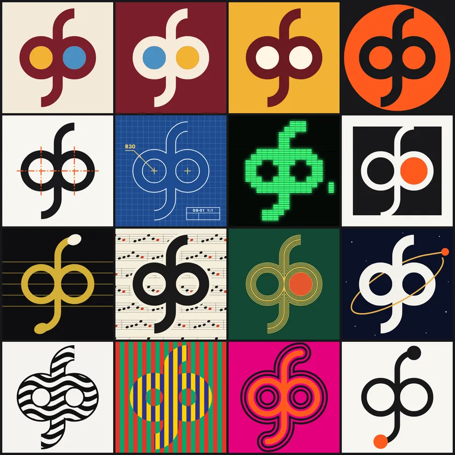
I liked it because it is a rule, not an ornament. A whole family came out of it (coin, technical drawing, circuit, patterns), plus a mosaic where every cell is the same gb in a different material.
The problem
I showed it to a friend. He looked and saw something else: two round shapes stuck to the base of a long stem. An anatomical reading nobody asked for, and once you see it, you can't unsee it. He was right.
My first reaction was an engineer's: fix it. I pulled the letters apart, offset the bowls, shortened the stem, tilted everything. I made 22 sketches and gave each one a risk score.
But the score was mine. I already knew what I was looking for, which made my own eye the worst possible instrument to measure it.

The test and the rule
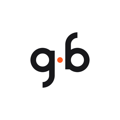
So I stopped drawing and set up a legibility test. Three neutral cards, no name, same scale: the g·b (separate letters with a dot between them), the original merged gb, and the Coin, which is the gb inside a disc.
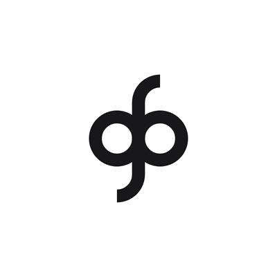
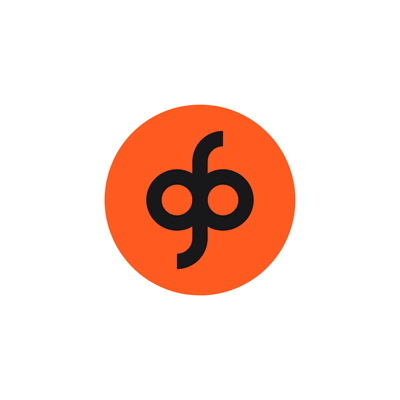
I sent them to about twelve people, one image at a time and in different orders. For each image, two questions: what do you see? And if you had to read letters in it, which ones? Nobody had heard about the criticism. At the end, a board with the three brand options and one last question: which one looks most like me?
Before seeing a single answer, I wrote down the decision rule:
Decision rule · written before the answers
- If two or more people mention something anatomical without being prompted, the form is out as a static symbol.
- If fewer than two thirds read g and b, the form loses points.
- Among the forms left, the one most chosen in the final question wins.
- If there is a tie, the one that works best as a 16 px favicon wins.
- After the decision, no new exploration. Only finishing work.
The decision
- ~12
- people, one image at a time
- 2
- anatomical readings of the merged gb
- 0
- anatomical readings of the g·b
The merged gb got two spontaneous anatomical readings. By the rule, it was out as a static symbol. And its most common reading wasn't even that: it was “glasses”.
The g·b got none. It was the one most often read as letters and the most chosen in the final question. It won.
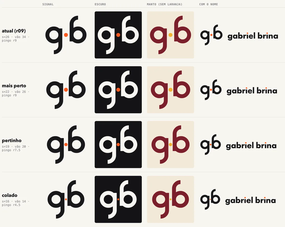
The dot in the middle is not decoration. It is the dot over the i's in gabriel and brina, which carry the same colour in the written name. And it is the centre of rotation: turn the mark 180° around it and the g still becomes a b.
The limits are real. Twelve people is not many, and they were all people I know. A test like this does not measure public preference. It is for finding problems I would not see on my own.
And there was a mistake in the test design. The cards were numbered 1, 2 and 3, and so was the final board. Some people answered by the order in which they had received the images, not by the number on the board, and the first reading of the votes came out wrong because of it. Next time, no number repeats between steps.
After the decision, only finishing work. I tried four distances between the letters and kept the third. On light backgrounds the dot went from saffron to ochre, because saffron almost disappeared on cream.
What stays in motion
The merged gb was not thrown away. It is still alive, just in motion. In the animation at the top, the letters move closer, merge into the original design, turn 180° around the dot and separate again.
Standing still, it read wrong. Passing quickly, it is just the g turning into a b.

What I learned
The hard part was not drawing. It was stopping. With a generator in code there is always room for one more round, and one more round feels like work.
But “does this read wrong?” is not a question you answer by drawing. You answer it by asking people, with the rule written down first, so the criterion cannot shift after you see the result.
It is what I try to do at work as well: a hypothesis, a small test, a decision. Here, it fit into a dozen conversations.